

XXI century equipped us with a load of quick and effective tools, that help us search for information quickly and effectively. With this in mind I come up with the idea how to improve Internet searching even more.
Imagine a search tool, which would do statistics on the amount of colours in architecture pictures. What inspired me to this was typing in Google simple phrase “architecture”. I scanned the graphics in terms of the colours of their buildings and the pattern became clear.
The first building was mostly white with some brown accents, the second totally brown with blue details, the third, completely white, the fourth white, the fifth white and the rest only white, white, and white.
There are many reasons for this penchant for white in architecture. It’s elegant, neutral and clean. White interior appears clear, while white exterior efficiently reflects sunlight providing thermal comfort, and also reflects the natural tints of the surrounding, giving a nice visual effects.

Especially, during sunset.
The power of colours
It’s amazing to what extent colour can change the character of a place. If we took two photos of the same place, from which one is black and white and another is colourful, and asked somebody what is his impression over the first, and further the second one, we might receive two completely different answers.
After all, colour had, and still has a very strong meaning for us. Cultures around the world were associating colours with the elements of the world. Moreover, symbolism of colours has been often used in pop-culture, by associating hues with peoples’ traits, and especially successful example of this can be seen in the well-known TV series – Power Rangers.
Polychromy
Most commonly, it was the surrounding that determined the colour. For example, if in a region we can come across big amounts of red stone, we can be sure that houses nearby will be coloured in a similar hue.
On the other hand, there have been also cultures which opposed this manner, and started to employ hues and shades strikingly different than the local ones. This refers also to the issue, eagerly taken up by architecture professor, willing to astonish their students. The curiosity refers to the ancient Greek temples, which have etched in our minds as brightly white, which in fact were densely polychromed with Greek ornaments and motifs. What a surprise!
Colour follows function
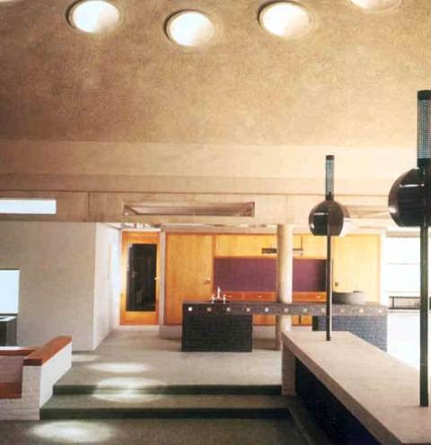
Because, of the physical settings of light architects in the design process must inevitably come across the strength of colours, in implementing character of the place. Architectural qualities, described by Rasmussen in Chapter I “Basic Observations”, are also dependant on colours. Heaviness, softness, roughness and tautness can be all either emphasized or obscured, simply by using colour.
Zaha Hadid’s Library and Learning Center is a good example of employing black and white colours in architecture. Zaha is famous for her play with architectural form, and in this building the solids underneath contrast, due to their light, white colour, to the bulky, black wedge aloft. Such composition makes us anxious on the very deep level of our perceiving architecture.
Although, this project uses tints rather to disturb the viewer, more commonly architects employ colour in order to accentuate their architecture. The building of the well-known phenomenologist, Peter Zumthor, Therme Vals has materials of distinctive black hue, which makes the terms appear heavy and hard, firmly standing on the ground.
Old, Great masters of European culture, especially in the period of Baroque had penchant for deceiving our eyes, by painting fake architecture details on walls, or creating spatial illusions with perspective on ceilings. Trompe l’oil, how it was called, was praised at that time as the highest mastery in painting.
Deceiving the eye stuns at first glance, what works perfectly in temples, but defeats its purpose in houses and places we live daily. Employing colours on materials different than natural annoys on a long-term in the same way, if we painted our dinner blue. Regardless how interesting it would appear, we lose all our appetite at once.
How to put colours
That’s why the walls of old big temples are most commonly painted white. By this easy and cheap method the hall seems more spatial. On the other hand, in smaller, more intimate rooms we expect more lively colours, which will keep us in the premise that walls are close to us and are visibly confining our space.
At the end of the chapter, Professor Rasmussen recalls an interesting example, in which he juxtaposes two, XVII-century, Dutch painters, Johanees Vermeer, whom art I covered in my recent post, and Pieter de Hooch. The specific atmospheres of their art are tightly connected with the light studies the artists conducted in their houses, however these were uneven. Due to the difference in the building orientation, two painters’ used different daylights, and therefore also obtained different atmospheres. Vermeer, whose windows were facing North used more pale palette that Pieter de Hooch, who worked at afternoons, when the Sun cast saturated, red light, making his paintings more nostalgic and colourful.
